Free Color Analysis From One Photo
Upload one clear photo for an estimated color season, nearby alternatives, and a palette of colors to try. The result is a starting point you can inspect, not a professional color consultation.
For a more useful estimate, use even natural light and avoid filters or heavy makeup.
Analyze your colors from one photo
Use a clear, evenly lit photo. Different lighting can change this estimate.
See the tool run on a sample photo
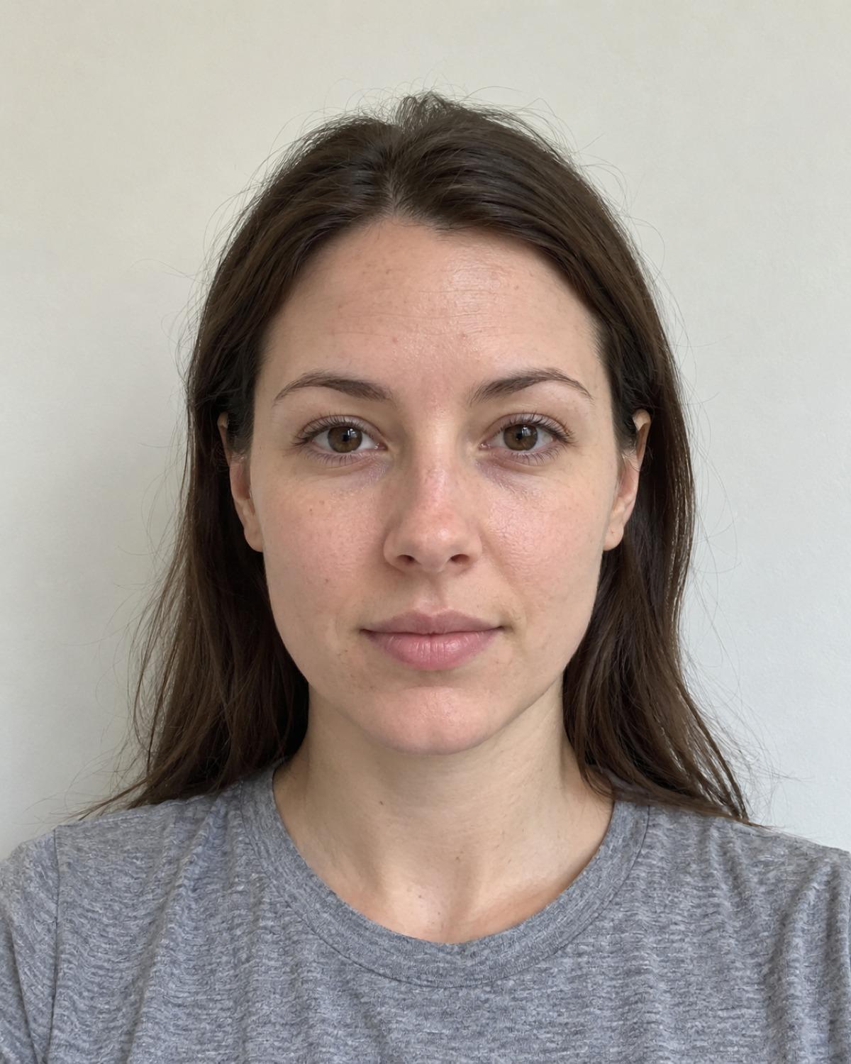
This photo produced
Summer · Spring as a nearby possibility
The tool read lightness L* 73.1 and color balance b* − a* −0.8 from this photo. It suggested these four colors to compare near the face.
This is the tool’s estimate for this image, not a verified personal season. The same photo appears in the sample report.

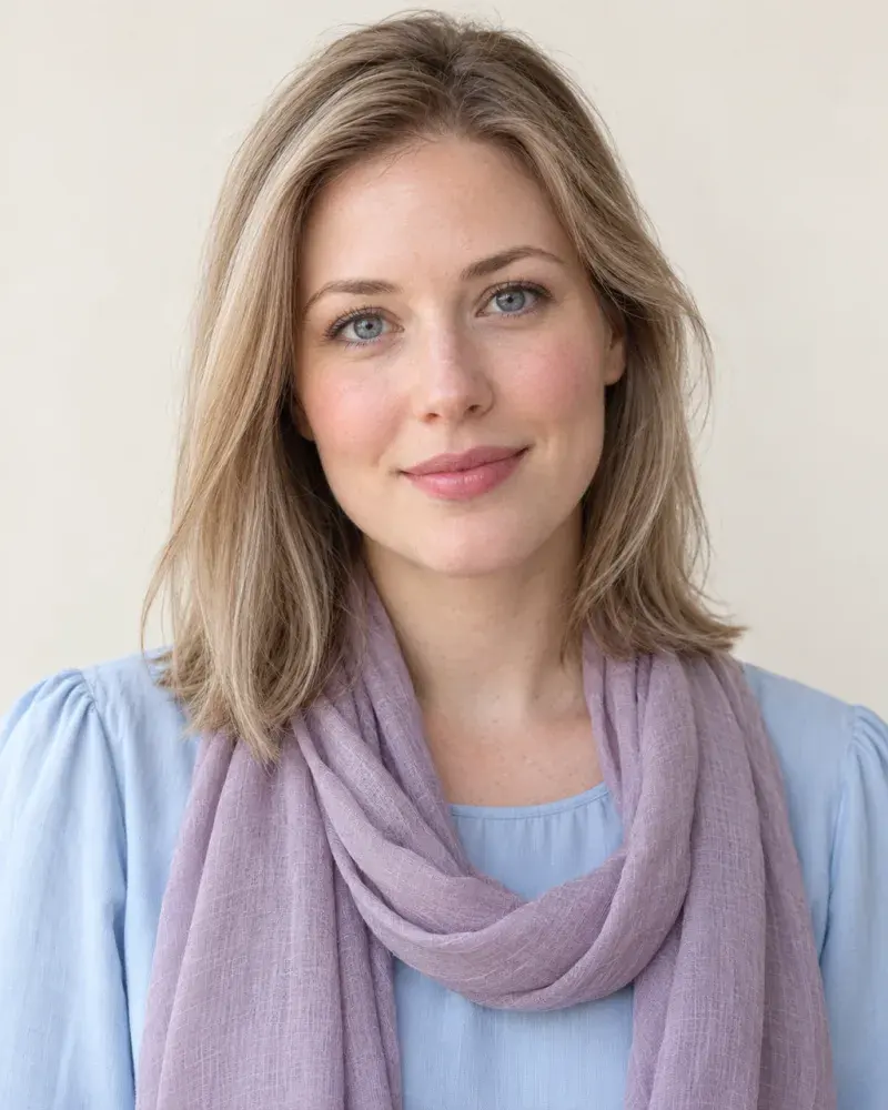
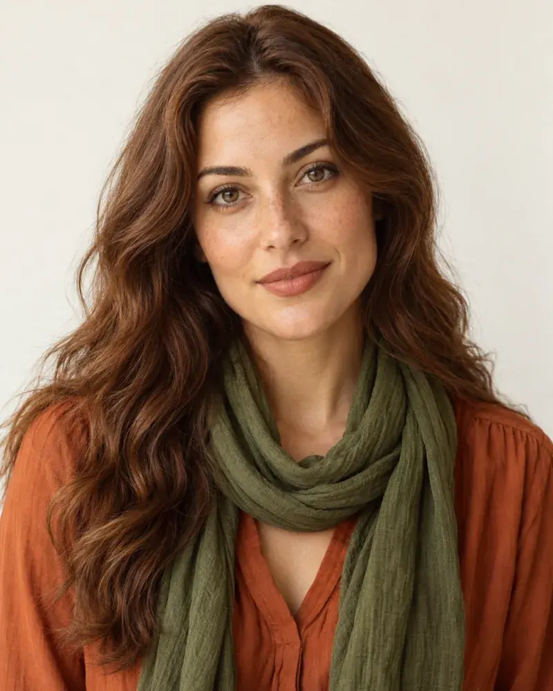
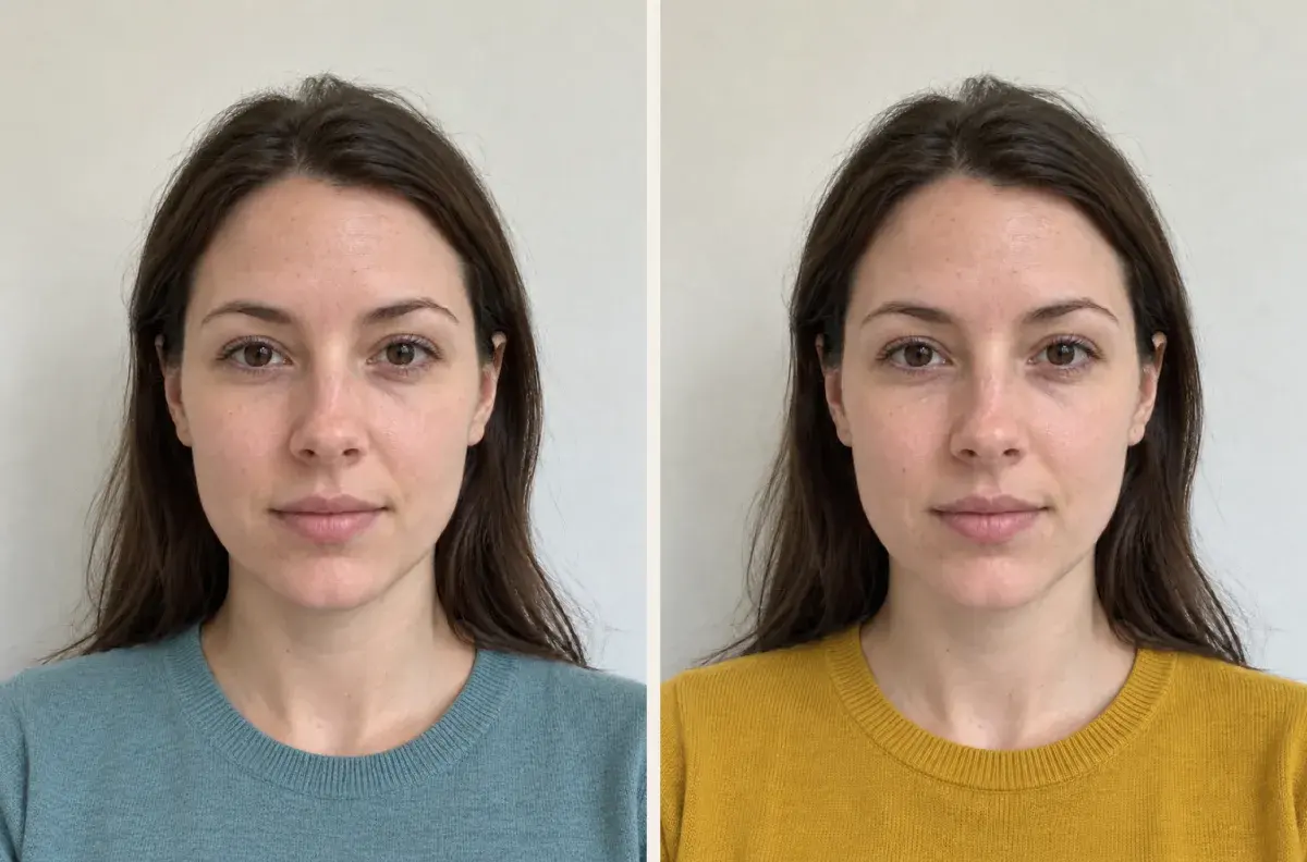
The same photo, edited to show the Summer pieces above: a powder-blue top with a mauve scarf. AI-edited demo, not a try-on result.
Four seasonal outfit combinations to compare
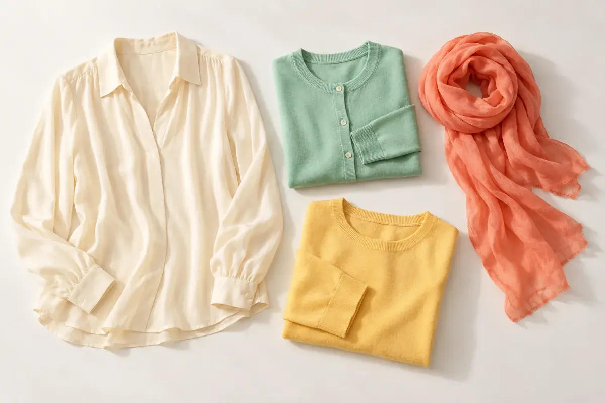
Start with the season shown in your result, then compare the nearby alternative with pieces you already own. The photos show one way to wear each palette; the swatches in your result are the colors to match. The people shown are reference models for each season, not the person in the sample photo.
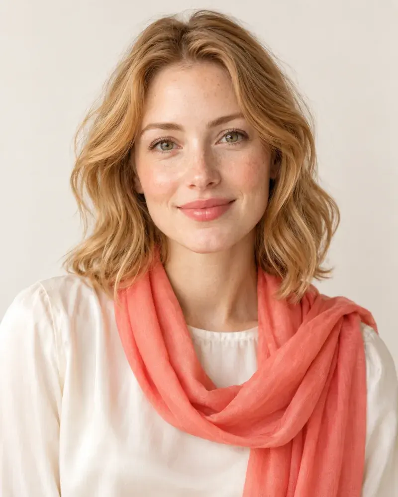
Spring
- #F6C65B
- #78BFA0
- #EE8067
- #F8E7C9
Cream + coral
Try a cream top with a mint knit, a soft yellow layer and a coral scarf.
See the pieces
Summer
- #A8B9CE
- #B38CA8
- #6C9BA1
- #E8D9DF
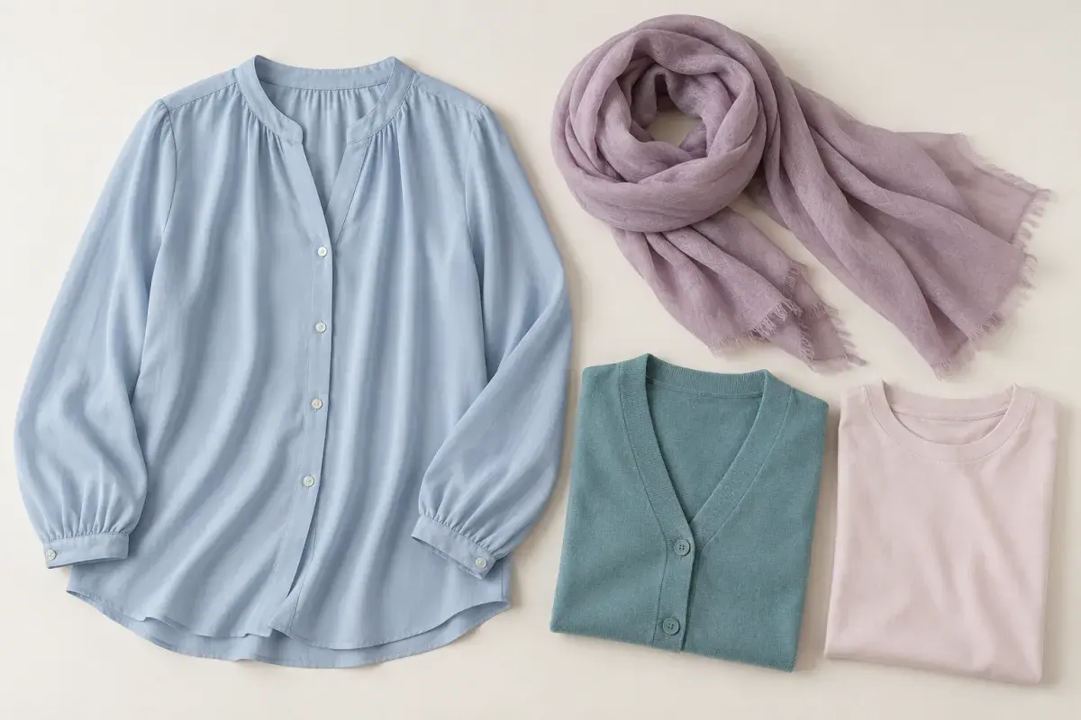
Powder blue + mauve
Try a powder-blue top with a mauve scarf, a dusty teal knit and a pale pink accent.
See the pieces
Autumn
- #A96237
- #667B4C
- #C99A56
- #6B4B43
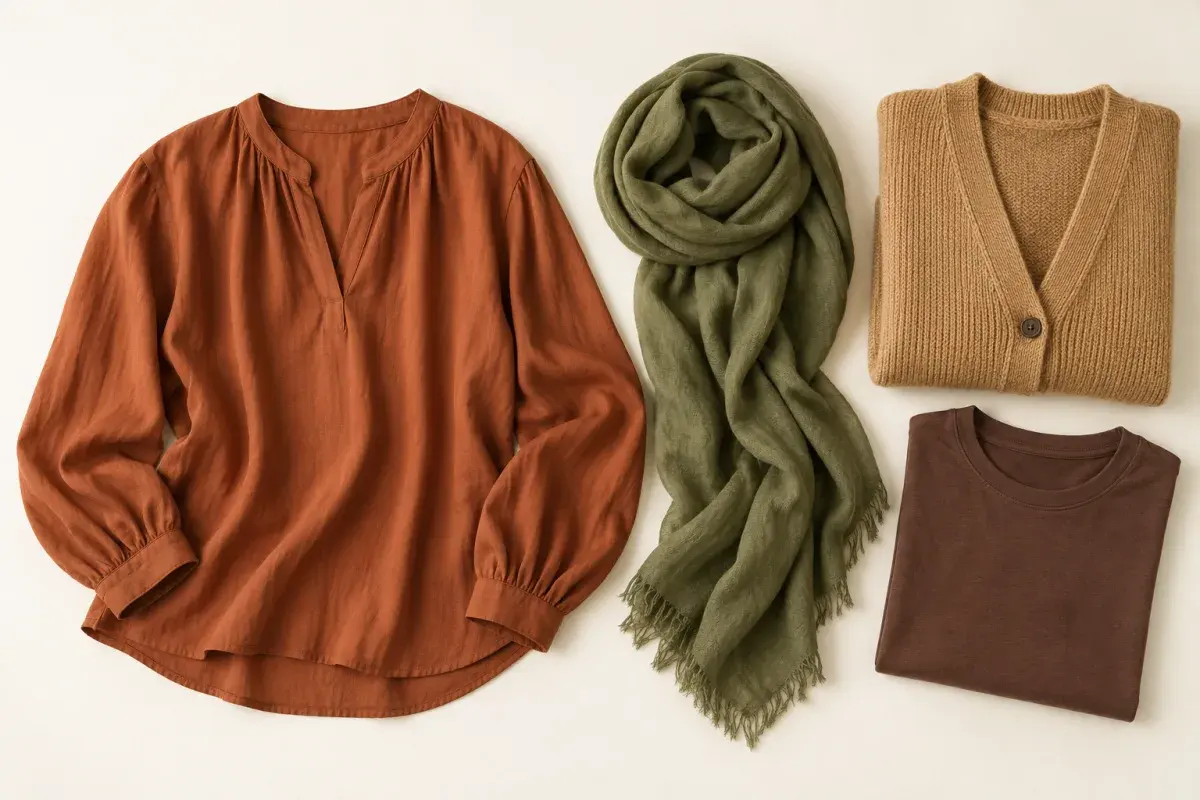
Terracotta + olive
Try a terracotta top with an olive scarf, a camel knit and a warm brown accent.
See the pieces

Winter
- #244B89
- #C43F67
- #227B78
- #F5F2F4
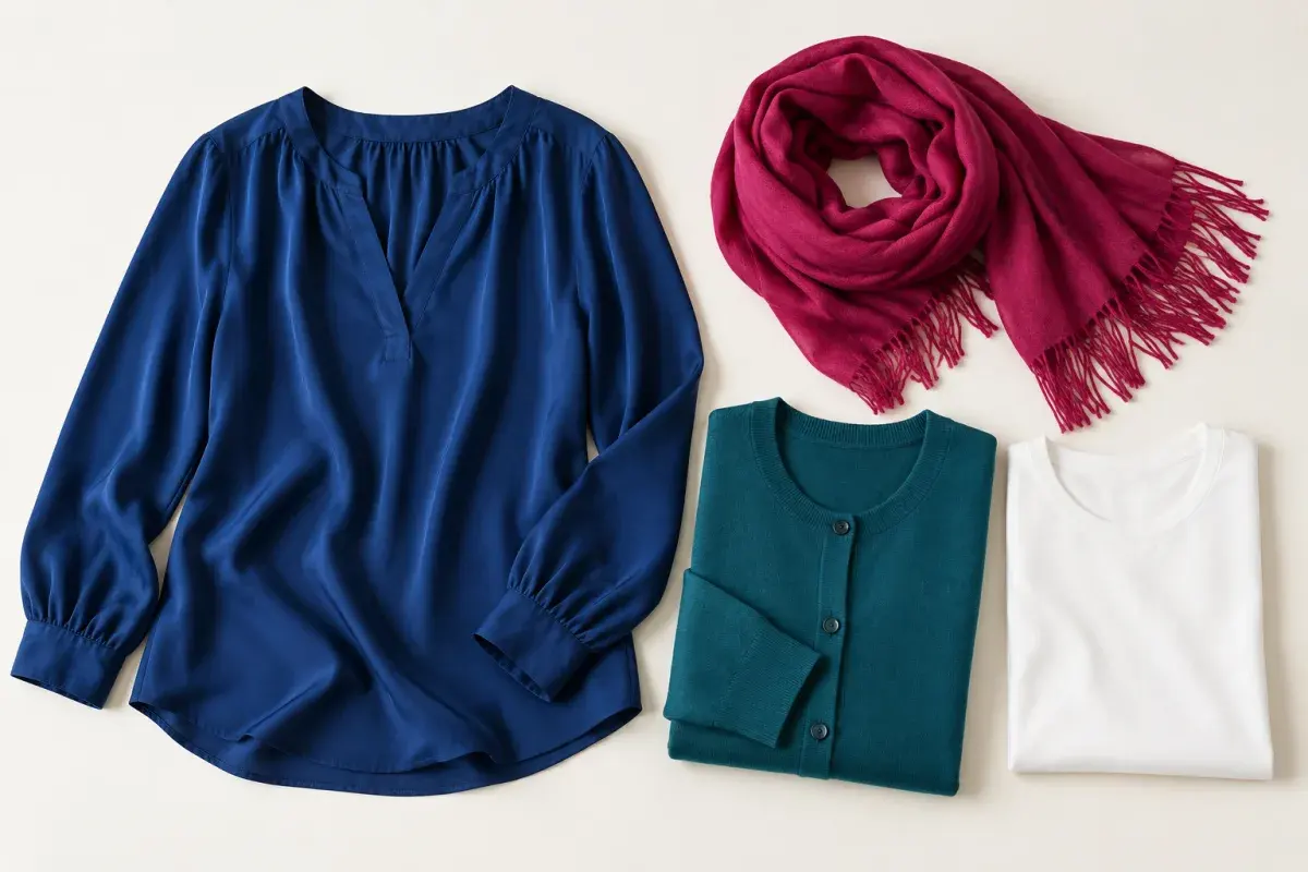
Deep blue + berry
Try a deep blue top with a berry scarf, a clear teal knit and a bright white piece.
See the pieces
How to compare colors near your face
Choose one top or scarf from your suggested season and one from the nearby alternative. Hold each near your face in the same daylight, keeping your position and expression steady.
Compare whether your face appears more even, whether shadows under your eyes stand out more, and whether your eyes look clearer. These are things for you to observe during the comparison; the tool does not measure them. Keep the effect you prefer.
Ways to use your palette
Start with tops and scarves already in your wardrobe. Use the palette to choose a pair to compare, then try the combination with the rest of an outfit.
For makeup, compare lip or cheek shades in a similar color direction. Let your usual style and the occasion guide what you keep.
Wear with confidence, or usually skip
The colors to try and the colors to compare carefully for each season, the same ones your result shows.
Spring
Wear with confidence
- #F6C65B
- #78BFA0
- #EE8067
- #F8E7C9
Usually skip
- #302B43
- #8B8794
Summer
Wear with confidence
- #A8B9CE
- #B38CA8
- #6C9BA1
- #E8D9DF
Usually skip
- #DB8D2F
- #4A2A18
Autumn
Wear with confidence
- #A96237
- #667B4C
- #C99A56
- #6B4B43
Usually skip
- #D7B8E6
- #DDECF5
Winter
Wear with confidence
- #244B89
- #C43F67
- #227B78
- #F5F2F4
Usually skip
- #C09A65
- #C8B9A5
How to use this photo estimate
The tool samples skin color in one image to suggest a four-season direction and a nearby alternative. Lighting, camera processing, filters and makeup can shift those recorded colors.
Use the two palettes to guide an in-person comparison. If the tool asks for another photo, follow the reason shown and retake it with your face visible in even light.
A short history of color seasons and photo analysis
1976
The International Commission on Illumination introduced CIELAB, a numerical way to describe color.
1980
Carole Jackson’s Color Me Beautiful presented seasonal color categories as a guide for personal wardrobe choices.
2020
Google researchers presented Attention Mesh, a model that predicts facial landmarks in photos in real time.
This site samples skin color from your photo to suggest one of four seasons and colors to try.
Color analysis questions
References
These sources document the history and technology described above; they do not validate the accuracy of season estimates from a photo.
- 1. International Commission on Illumination. “Colorimetry — Part 4: CIE 1976 L*a*b* Colour Space.” CIE S 014-4:2007.
The 2007 standard page describes CIELAB and notes that CIE introduced it in 1976.
- 2. Carole Jackson. “Color Me Beautiful.” 1980 edition.
Catalog record for the 1980 edition of Jackson’s seasonal color guide.
- 3. Valentin Bazarevsky et al. “Attention Mesh: High-fidelity Face Mesh Prediction in Real-time.” 2020.
Google Research paper describing real-time facial mesh prediction; it is not evidence of color-season accuracy.
Try your own photo
Get a starting color direction, then compare the suggested palette with colors you already wear.
Analyze my photo